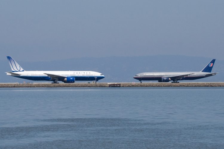
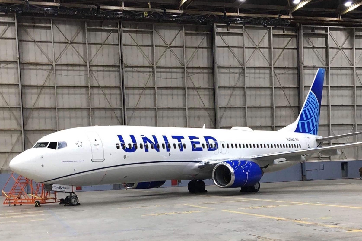
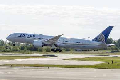
United Airlines will officially present the new livery of its planes as well as its redesigned visual identity on today. However, the image of a Boeing 737 with the new color scheme ended up leaking on web hours before the event.
And the result of the reformulation was not surprising. Maintaining the same typography and logo, United only eliminated the gold color from Continental and replaced it with a lighter shade of blue.
The stylized tail globe has received the new color as well as the winding line applied on the fuselage. Finally, the name “United” grew in size, reaching up to the windows area, and the engines painted again in the darkest shade of blue.

The new livery seems to want to emphasize a return to United Airlines standards, although the logo is still an inheritance of Continental, which merged with it in 2010.
Remarkable liveries
Founded in 1931 after the merger of several small airlines, United Airlines has undergone some significant changes in its visual identity. After years in which it exhibited a simple scheme with red and blue stripes, United commissioned to the designer Saul Bass its first logo.
The result of Bass’s work was fabulous, a tulip-shaped logo composed of two overlapping “U”s and painted in blue and red. This symbol remained in the company until the merger with Continental, but the livery of the aircraft did not.
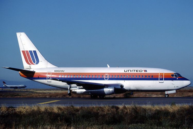
The scheme that debuted the tulip was called “Rainbow” because of its three stripes in orange, red and blue that went from nose to tail on a fuselage painted white. This characteristic painting remained untouched until 1988 when the company expanded the name “United” and downgraded the stripes in three colors.
In 1993 the livery “Rainbow” was replaced by the scheme called “Battleship Gray“, an elegant combination of gray at the top of the fuselage with a dark blue at the bottom. The two tones were separated by the stripes of the previous painting. The tail, in turn, kept the tulip, but smaller and superimposed on a background with two-tone stripes of blue.
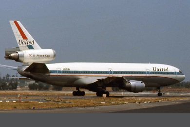
It was this livery that was marked in the terrorist attack on the World Trade Center in 2001, when a company’s Boeing 767 was launched against the skyscraper of New York on September 11.
Rising blue
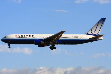
In 2004, a major new change. Designed by the Pentagram agency, United’s new livery became lighter and focused on the color blue. The company prefered to preserve the tulip, but it was drawn on the tail in shades of white and a much larger size.
In the fuselage, the lower part received a livelier blue and small stripes in gradient tones. The upper portion of the fuselage has returned to white and a new typographic font in black. At his side, the original tulip. The scheme became known as “Rising Blue” or “Blue Tulip”.
The end of the tulip
The 2004 livery was the last to display the tulip, changed for the globe logo as part of the merger with Continental six years later and that gave rise at the time to the largest airline in the world.